
Le Tour is back around and so is its drama.
This year’s race format should make it more competitive, the controversy over the proverbial favorite has left a cloud over the competition.
Already a couple of stages in you can see the effect that shortened rosters are going to take, so I’m pretty eager to see how this plays out.
Not as eager though for my 2018 jersey preview!
There are always a few teams that change it up for the race (Team Sky, Lotto-Jumbo & Trek for 2018) which is a fun way to keep it fresh and we already had a fashion controversy when Peter Sagan turned down wearing the Green Jersey to keep himself in World Champion stripes!
I love it.
This year, I’m including the previous rankings from all 22 teams to show who has moved up or down.
One perennial favorite saw quite a drop….
Onto this season’s rankings!
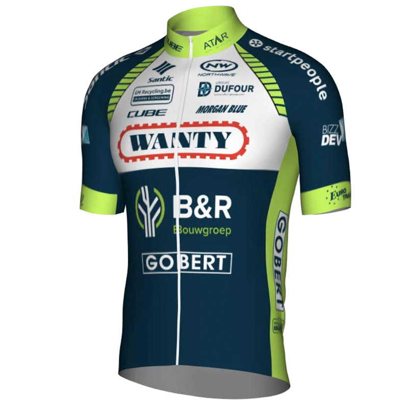
22. Wanty – Groupe Gobert (Last Year’s Rank – 22): The consistency of Pro-Continental teams are so…consistent! Either a team’s jerseys remain really good or stay very bad. Thank you Wanty for proving my theory year after year. These kits are timeless in that they’d be considered bad in any decade. And if you squint, you’d might be convinced these are the Orica-Greenedge jerseys from any of their multiple iterations.

21. UAE-Team Emirates (Last Year’s Rank – 18): These kits are so innocuously bland that I don’t even have any idea who is on this team! Maybe the idea was to design a kit based off of 90’s clip art, but that would have taken thought. These jerseys haven’t.

20. Astana (Last Year’s Rank – 16): They have been ugly for so long that sticking with this updated design from last season can be counted as a big win. It’s still solidly in the “meh” category, but that’s way above their average from over the years. Whoever decided not to try anything stupid deserves a brilliancy award.

19. Confidis (Last Year’s Rank – 20): It’s been 20-ish years that this team has taken part with almost the same jersey. There are slight tweaks every season just enough to make you know there’s a difference. They’re starting to grow on me now, like it’s one long joke someone has been spending millions on over the years at our expense.

18. Team LottoNL-Jumbo (Last Year’s Rank – 19): Less ugly. I don’t want to get into it, but that’s how I feel compared to last season’s jerseys. When you have that Pittsburgh Steelers / Penguins / Pirates color palette, it’s hard to go wrong, but not a lot of TLC here. These belong more on a softball team.

17. Team Sunweb(Last Year’s Rank – 14): Keeping a jersey unmuddled is a nice thing, but if the result is an overly bland result, you might want to think twice. Once again, Team Sunweb stuck with boring elements and kept their same plain old look. Yuck!

16. Quick-Step Floors (Last Year’s Rank – 21): In some sense, these jerseys aren’t too different than Wanty’s, but Quick-Step is a Pro Tour team so they unfairly get a few extra points. They also have Belgium champion Yves Lampert who also looks super sharp in his national jersey, so I’ll continue to add to discriminatory extra credit points.

15. BMC (Last Year’s Rank – 17): This team has been making a lot of negative news as it scrounges for a new title sponsor for 2019. Does their ugly-oversized Tag Heuer logos have anything to do with it? No, just as a writer, I’m licensed to make a joke about it. It’s TIME things change! The added blue collar is also a struggle for help!

14. Team Sky(Last Year’s Rank – 3): What an amazing achievement in jersey design. Never have I seen such a fall from grace for these Tour de France specific jerseys. Maybe they will raise awareness for a good cause, but can you forgive the cheesiness of the whale? I thought maybe it might look cool to see a group of teammates advance like a school of fish, but you can’t forget the bad taste it leaves in your mouth. Even the front of the jerseys which is simple enough is wrought with awkward proportions. Did they make these changes to draw attention elsewhere? I wouldn’t know why. Bottom line, these kits have definitely jumped the shark.

13. EF Education First – Drapac(Last Year’s Rank – 13): Teams rarely incorporate pink even though they look awfully sweet for the Giro’s leader jerseys. EF Education’s main color matched with the fluorescent green Cannondale hue looks like an awkward pairing. I’m sure the common opinion is to go less, but a decent portion of their jerseys contain white. I say go all out and amp up the hi-vis for next season. It can’t be any worse!

12. Team Fortuneo – Samsic (Last Year’s Rank – 15): When I first saw the thumbnail of these jerseys, I thought they were the same ugly rejects from last season. But alas! CiclaValley can do his homework! While the design is essentially the same, the choice of colors (or you could say lack) gives this team a much higher grade. Nice improvement, but they aren’t supposed to contend to notice them as much.

11. Lotto Soudal (Last Year’s Rank – 10): Classic jerseys are easy to do. Heck, even I was able to do a solid effort in my first jersey design by keeping it simple. Of course, it helps when you’re not tasked with plastering dozens of sponsors on them.

10. Dimension Data(Last Year’s Rank – 6): We all have some idea what Dimension Data does as a company, but what they specialize in I really don’t know. All I know is the designs come with an efficiency computer nerds would love and if you happened to snag one of these at a work party, I’m sure the employees would wear it with pride.

9. Michelin Scott(Last Year’s Rank – 7): While this team is just a continuation of the Orica team for years, the colors did not. The squad still is Aussie laden, but gone is the blue and green tones you so long associated the team with. Black and yellow are two colors that always pair well and the design is simple making the overall look sharp. Still, there isn’t a high level of difficulty here. I’d give them a higher ranking, but that would be like giving a gold medal for diving for someone that just did cannonballs.

8. Ag2r La Mondiale(Last Year’s Rank – 8): How many sports teams incorporate brown that aren’t called the Browns? Very few. Matching this color with blue has produced uniquely pleasing results. This year’s jersey looks safer than other iterations which makes the combination of these color patterns more bland. Fashion is huge in France, so this team gets a pass this year.

7. Movistar (Last Year’s Rank – 9): Less is more. Movistar had their biggest update in the past few years shifting from a darker blue to a lighter one and ditching all the extraneous colors. The result has a more modern feel even though it feels simple. Somehow, it makes the logo look more cartooney so bring on the fun.

6. Trek Segafedo (Last Year’s Rank – 4): I’m starting to think Trek uses a random generator to pick their jersey schemes year after year. It’s either going to be red, white or black with the sleeves a secondary of one of those colors. They still look good, but I’m just saying….

5. Katusha – Alpecin (Last Year’s Rank – 12): I’m a sucker for kits with terrible looking color palettes that are able to pull something out of it. Powder blue mixed with red and a crimson shade as well? Sounds like a recipe for disaster. Yet the proportions and the play against each other just work. When you absorb it, these kits remind you of the blue jersey era in baseball that was much maligned, but now beloved. Don’t you see a bit of those lovely Philadelphia Phillies uniforms in these jerseys?

4. Bora handgrohe (Last Year’s Rank – 11): This jerseys go under the radar because when you see a Bora rider on tv, 99% of the time it’s Peter Sagan wearing his World Champion stripes. Every season we’re been seeing solid progression with their design work. Black & white + a third color is an easy way to start, but there’s some great proportions and I love the modern looking fade. Just have your guy stop winning races so we can see it more!

3. Groupama – FDJ (Last Year’s Rank – 5): Does anyone remember the short lived show Pan Am which tried following in the footsteps of Mad Men reliving the gloriness of the 60’s? I hope not, but had the show made it past a full season, it wouldn’t surprise me that there would have been some plotline that included FDJ’s kits (trust me: episodes were so bad they could have worked this in). While still sticking to their regular color palette, there is something clean and fresh that make these kits look like aviation at its finest.

2. Bahrain Merida Pro Cycling Team (Last Year’s Rank – 2): Most people probably didn’t notice, but there was a slight change in the sleeves for this season’s jersey. No matter. It still retains the classiness and wonderful color balance making these kits look super elegant. The good news is that they have the highest ranking of any World Tour team for the second straight year, but the top prize goes too….

1. Direct Energie (Last Year’s Rank -1):– For the second year in a row, Direct Energie gets to hold the top spot. It’s an innovative design and you already know how well I think black and yellow go together. You can also thank Sylvain Chavanel for spending major time in the breakaway on Stage 2 giving us a long look at them. Don’t rest on your laurels though DE. I’m not going to let you sit at the top for a third year unless I see changes!